As a customer, and I am sure you have seen it too, there are forms out there that have you saying, “It’s just not worth it” and immediately leaving the site. The key to a great lead generation form is design, ease, and the content that surround it on landing page. Let’s take a look at 5 examples of lead gen. forms and the elements used to appeal to their visitors. 1. BASECAMP 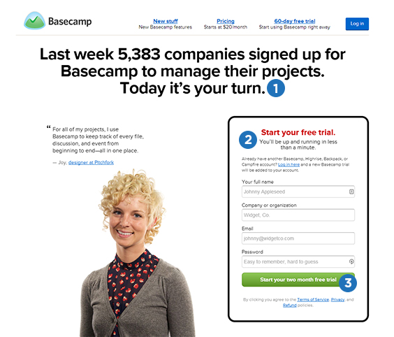
- Headline: A Bold statement that goes back to American Politics. Being that 5.383 is a fairly impressive number for a single week, why wouldn’t they use this to their advantage? Such a statement compliments the form well and will get others to sign up.
- Expectation: I like that they highlighted this guarantee of “being up and running in less than a minute”. Time is important to customers, especially while on the go. Putting my trust into the company, this tells me that my time won’t be wasted filling out much more information than the few fields I see before me.
- CTA: It is important your customers know exactly what action to take and why they are going to fill out your form. They highlight at the top of the form in red but I love that they chose to customize the copy on their button by confirming that I will, in fact, be getting a two month free trial by submitting my information. There is nothing worse than a standard button that just says “submit”.
2. FASTTRACK 
- Human Aspect: Our eyes naturally go to graphics, especially when those graphics are people. By placing a person behind the form, they are almost guaranteed that visitors will also see the form, Genius!
- CTA: Like Basecamp they don’t use terrible, standard copy on their button. Their visitor knows exactly why they are filling out the form and can expect to get an estimate at the end of the transaction.
- Trust: With all the scams that plague the internet, it is a good idea to instill trust. FastTrack does this by sharing reputable sources that have featured their company and product.
3. USAUTO 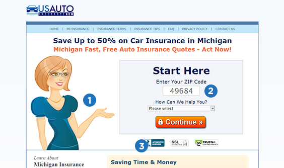
- Direct Attention: If your landing page includes graphics (even inanimate objects) if at all possible make sure they are facing the portion of the page you want your customer to also focus. Not only is this lady gesturing to the form she is also looking at it. Naturally you want to know what she is looking at… Oh hey! There’s the form!
- Short: The form is simple and short. Enough said.
- Trust: Trust symbols go a long way. According to Elisa Gabbert, Senior Content Development Manager, “The most obvious form of trust symbol is a security badge or seal, indicating that your check-out process is secure and has been verified by a trusted third party.”
4. HOOTSUITE 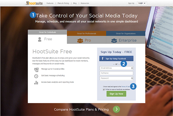 Hootsuite doubled their homepage as a landing page (and are conducting an A/B test on it) by including a bottom of the funnel form. What better way to reach all your site visitors!
- Headline: This is such a powerful headline! Who doesn’t want control, sold.
- Fill in: Not only is this a super easy super short form, but Hootsuite also makes it easier by offering sign in with facebook.
- Option: Personally I hate junk in my email and typically delete it without opening it, others love getting constant update. It is great to have options.
5. THE LADDERS 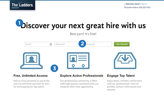
- CTA Headline: In this case the headline doubles as the CTA. Love the simplicity.
- Short: Again, one thing that makes this form great like the others is that it is short and there isn’t unnecessary fields to fill out, CEOs everywhere thank you.
- What you get: In this simplistic landing page, The Ladders still managed to tell visitors what they are signing up for. Quick and to the point.
There you have it, 5 forms that are sure to be converting beautifully. For more on lead generating forms head on over to our previous blog post, Lead Generating Forms to Optimize Conversion Rates.


